
Poster sessions are a key component of most academic conferences. However, rows of text-heavy posters can be difficult for attendees to navigate, particularly for those for whom English is not their native language, or who may be neurodivergent or disabled. Cochrane recently teamed up with researchers to introduce poster templates for the Cochrane Colloquium based on the latest research. The results from the 'real world' assessment are now available. We spoke with the researchers to find out more.
Can you tell us a bit about your elite poster research team, so we have an understanding of how you are approaching academic posters?Sure! Our team includes Dr. Zen Faulkes, author of the book “Better Posters” and founder of the Better Posters blog; Dr. Mike Morrison, the psychologist who created a redesign for scientific posters that went viral and started the #BetterPoster movement; and Dr. Emily Messina and her colleagues at IPG Health Medical Communications (Noofa Hannan, Victoria Evans, and Anja Petersen) and Helios (James Wells).
What do you see as the purpose of academic posters?
For all the criticism posters get, they have incredible potential and play a crucial role in science communication. A scientific poster session is one of the only learning environments in science where researchers walk into a room completely open to learning. So, a key function of scientific posters is to give scientists broad, serendipitous insight into work going on across their whole field. Poster sessions are also a great way to meet people with similar research interests. Networking is a key purpose of attending a poster session, but the job of the poster itself is to communicate key ideas quickly (and engagingly!) in a stressful and demanding, busy environment.
Most conference attendees can probably relate to this. Most academic posters follow the same format that they always have. What’s wrong with them?
Imagine that you’re standing in front of a wall where somebody has taped up printed pages of a scientific paper, and you’re trying to read all that dense text and those tiny figures on the pages from four feet away. Now imagine trying to do that while there are a hundred other similar ‘posters’ you would like to see in a short time, while also trying to listen in to what the presenters are saying. Now imagine trying to do that if you’re someone with low vision or a processing disorder that amplifies the lights and sounds in the room. It’s difficult to learn anything from the poster in that context, which is why people often just give up and ask the presenter to explain the study, or just walk away.
That’s the core problem with the traditional scientific poster design: it ignores the context of just how busy and overwhelming the room is. This could be because the traditional design was created decades ago when poster sessions were much smaller.
There is also a harmful feedback loop in scientific poster design, where authors with (typically) no design training feel like they need to ‘fill up all the space’ with text and figures to ‘show that they did work’, and then the poster session attendees learn just to accept that cluttered posters will always be the norm and have to make do with them.
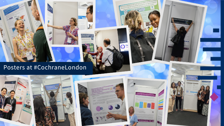
We had over 300 posters at Cochrane Colloquium and walking through them you could see many people used the accessible template. It felt less mentally overwhelming and was fantastic to walk around and learn from them. Can you tell us a bit more about the templates offered?
The #BetterPoster template we provided was based on the latest research in instructional design, accessibility, and eye tracking. It was designed to teach people something (typically the main finding) from a far distance; making it possible for them to learn something from every poster in the room, not just the few that they stop at. Then, the remainder of the poster is designed to quickly communicate additional details (limitations, key figures, methods) still visible at about 3ft. The figures also include mini takeaways, to help people interpret graphs while also trying to, for example, pay attention to you, the presenter. Finally, it includes a QR code that people can scan to get the author’s contact details or read the whole paper. The template was just that – a starting point to make it easier for people to get creative and make their own accessible posters. It was wonderful seeing people use the template whilst also adding their own touches.
At the event you made observations, interviewed people, and did a survey of attendees afterwards. What did you learn?
It was a great three days at the Cochrane Colloquium, seeing the poster template being embraced and people’s response to it. We just got back from presenting our findings at the 2024 European Meeting of the International Society for Medical Publication Professionals. Our survey and interviews found that more accessible poster designs may improve engagement and communication at conferences. People found the posters with large figures and limited text to be more engaging; posters using the template were cited as memorable or informative; and they were also easier to understand. Discover more in our video.
That's fantastic. This template was made specifically for the Cochrane Colloquium. What can researchers and those creating posters for any conference take away from this?
While the template was designed to the specifications of the Cochrane event, you can tailor them to any event that you need to present a poster at! We encourage all academics to download the template and adjust it as they need to. We're excited to see what you come up with; please tag pictures of your poster with #BetterPoster on social media so we can see them!