The Cochrane Colloquium is a premier event for those interested in evidence-based healthcare decision-making. It brings together individuals involved in evidence production, dissemination, implementation, and policy-making, as well as those making individual healthcare decisions. The 2023 Cochrane Colloquium will take place in London, UK from 4th to 6th of September 2023, with satellite events on 3rd of September. Registration is now open.
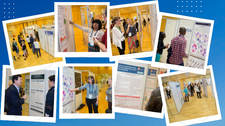
One of the key features of the Colloquium is the poster sessions, which have facilitated many collaborations, partnerships, and learning opportunities. This year, approximately 300 posters will be presented. However, rows of text-heavy posters can be difficult for attendees to navigate, particularly for those for whom English is not their native language, or who may be neurodivergent or disabled.
To address this challenge, we are collaborating with a team of researchers who are investigating the accessibility of presentations at academic conferences. As part of their work, they have created Cochrane Colloquium poster templates based on the latest evidence.
Can you tell us a bit about your elite poster research team so we have an understanding of how you are approaching academic posters?
Sure! Our team includes Dr. Zen Faulkes, author of the book “Better Posters” and founder of the Better Posters blog, Dr. Mike Morrison, the psychologist who created a redesign for scientific posters that went viral and started the #BetterPoster movement, and Dr. Emily Messina and her colleagues at IPG Health Medical Communications (James Wells, Noofa Hannan, and Anja Petersen).
What do you see as the purpose of academic posters?
For all the hate posters get, they have incredible potential and play a crucial role in science communication. A scientific poster session is one of the only learning environments in science where researchers walk into a room completely open to learning anything. So, a key function of scientific posters is to give scientists broad, serendipitous insight about work going on across their whole field. They’re also great for meeting people with similar research interests. Networking is a key purpose of attending a poster session, but the job of the poster itself is to communicate insight very quickly (and engagingly!) in a stressed, busy environment.
Most conference attendees can probably relate to this. Most academic posters follow the same format that they always have. What’s wrong with them?
Imagine that you’re standing in front of a wall where somebody has taped-up printed pages of a scientific paper, and you’re trying to read all those dense text and tiny figures on the pages from 4 feet away. Now imagine trying to do that while there are literally 100 other similar ‘posters’ you need to see in a short time, and while a presenter is standing in your personal bubble trying to talk to you. Now imagine trying to do that with low vision, or a processing disorder that amplifies the lights and sounds in the room. It’s difficult to learn anything from the poster in that context, which is why people often just give up and ask the presenter to explain the study.
That’s core problem with the traditional scientific poster design: It ignores the context of just how busy and overwhelming the room it’s sitting in is. Mainly because it was created decades ago when poster sessions were much smaller.
There is also a harmful feedback loop in scientific poster design, where authors with (typically) no design training feel like they need to ‘fill up all the space’ with text and figures to ‘show that they did work’, and then the poster session attendees learn just to accept that cluttered posters will always be the norm and we have to make due with them.
So, what would make these posters better?
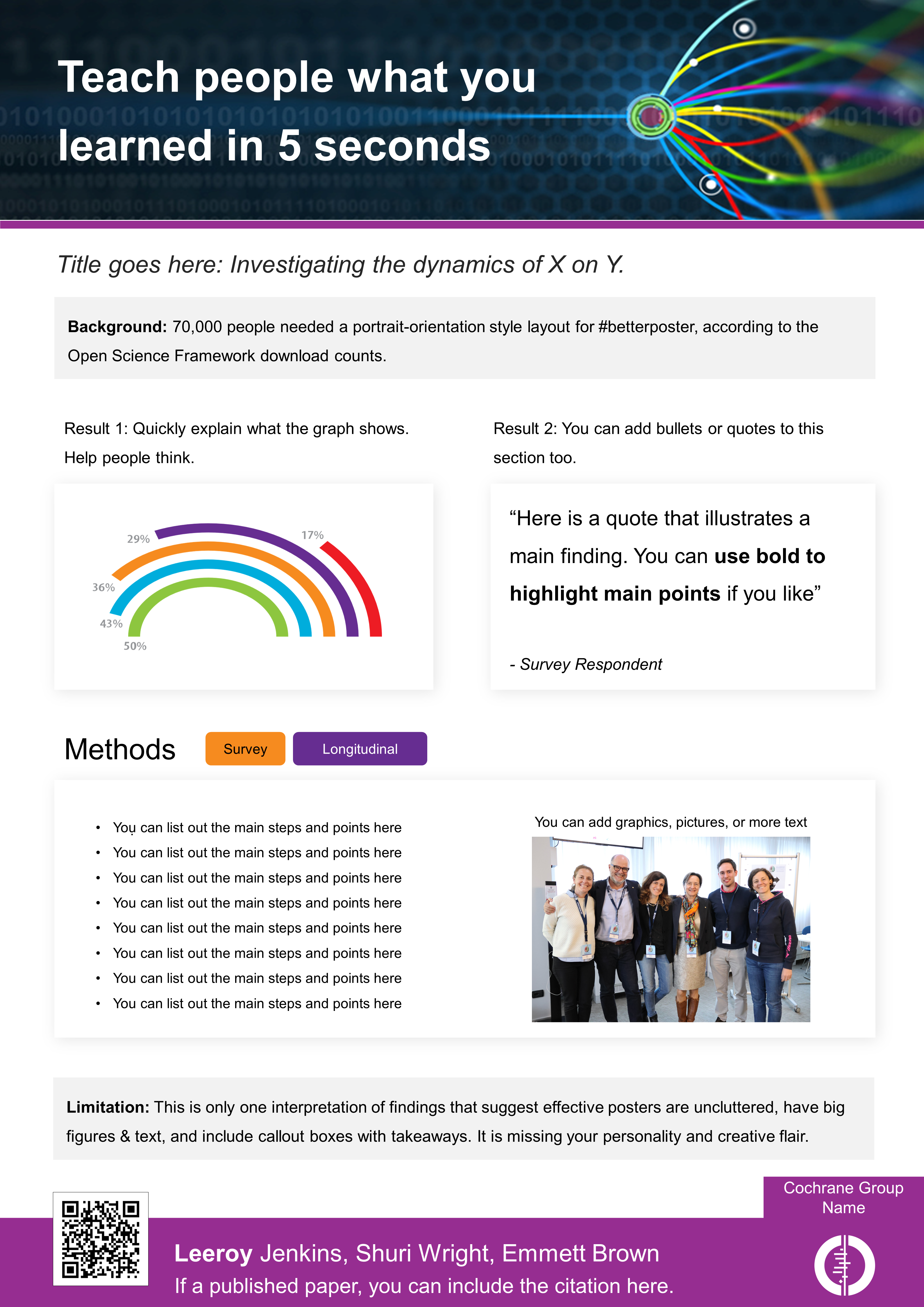
A ‘better’ poster is one that is designed to teach people about what the study learned fast, even when they’re mentally overwhelmed or standing far away. This typically means ‘better’ posters are much less cluttered, have big clear takeaways, and have bigger key figures and data visualizations. You can imagine how this is also unsurprisingly better for accessibility needs like low vision or ADHD.
Can you tell us more about the design you came up with?
The #BetterPoster template is based on the latest research in instructional design, accessibility, and eye tracking. It is designed to teach people something (typically the main finding) from a far distance; this makes it possible for you to learn something from every poster in the room, not just the few you stop at. (If you’re a presenter worried about ‘spoilers’, research so far indicates that this results in the same or more people actually stopping to talk). Then, the remainder of the poster is designed to quickly communicate additional details (limitations, key figures, methods) still at a distance of about 3ft. The figures also include mini-takeaways, to help people interpret graphs while also trying to, for example, pay attention to you the presenter. Finally, it includes a QR code that people can scan to get the author’s contact details or read the whole paper.
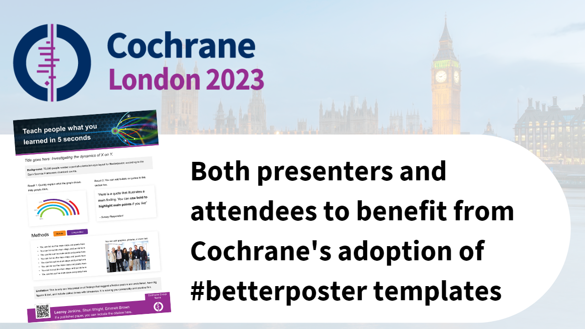
Cochrane is adopting the #BetterPoster design as the official poster template for the Cochrane Colloquium. What can poster presenters expect?
Poster presenters can expect to save hours of time in creating their posters and to have an easier time getting their information to the people who will be most interested in their content. You’ll notice that when people walk by your betterposter, more people will at least read your big main finding. When that happens, count it as a little win: you’ve just communicated something you’ve learned to somebody else who needs to know it, even if they didn’t stop. Then, when people do stop to talk, hopefully you notice that they’re able to engage with more content on your poster and ask you better questions because you made it big and clear enough to read. Presenters can download the templates here. The templates are adjustable to the specific size requirements of the colloquium, but they can also be adapted for other presentations in the future. And please get creative in how you make your poster ‘feel’! Communicating study-relevant emotion is part of good science communication. We're excited to see what you come up with; please tag pictures of your poster with #BetterPoster on social media so we can see them!
And what can attendees of the Colloquium expect?
You typically browse a poster session hunting for those one or two posters that are most relevant to you that you’re going to invest in. You can still do that, but now, with betterposters, you’ll be constantly learning as you’re hunting. You’ll learn something from every single poster you walk by, and then more from the few you decide to stop at. And if you stop to talk, it’ll be easier to see the figures and details while you’re talking to the presenter. And if you want even more on your favourite poster, scan the QR code for more detail that you can take away. We will include an evaluation within the official post-Colloquium survey and look forward to hearing attendees' feedback.


